How to Create A Great Hotel plus IR Website?

Introduction
AccorHotels, is a French multinational hotel group, which operates in 95 countries. Headquartered in Paris, France, the group owns, operates and franchises 3,700 hotels (spanning all inhabited continents) representing several brands, from budget and economy lodgings to five-star hotels.
A carefully crafted website design can be a powerful tool for establishing a brand. In the hotel business, a website gives the chance to present the services and atmosphere that is being offered to the target group via short video clips or impressive photographs.
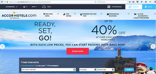
This impressive website of AccorHotels demonstrates how hotel websites can incorporate beautiful design and make each guest feel recognized, expected and valued in every one of their 4,100 addresses around the world in the right way.

User Experience
When it comes to designing or re-designing a website, it can be easy to get hung up on the aesthetics. However, if we look deeper into the AccorHotels website, it has succesfully accomplished something more than just design.
First and foremost, it is responsive. In a world where folks have more than a billion websites they can potentially land on, AccorHotels made sure their website's design is optimized for usability (how easy your website is to use) and user experience (how enjoyable interacting with your website is for actual users).
Closely tied to the principle of simplicity, visual hierarchy entails arranging and organizing website elements so that visitors naturally gravitate toward the most important elements first for example, creating a space investors can look to understand the qualitative aspects of the company's story. While providing financial data and reports is important, what separates the best sites in the world are those that focus on providing context on the company's strategy and clarity about its execution and vision. Like a well-written book, the website should drive a compelling narrative that an investor will want to consume. The best websites are ones that funnel users through a story without barriers to functionality - investors should be able to "flow" through the IR website so that they walk away knowing all essential elements of the corporate narrative, objectives and vision.
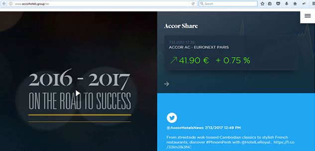
Part of the CAC 40 index
Remember, when it comes to optimizing for usability and UX, the goal is to lead visitors to complete a desired action, but in a way that feels natural and enjoyable. By adjusting the position, color, or size of certain elements, you can structure your site in such a way that visitors will be drawn to those elements first. For instance, you may prioritize events on your mobile site over reports, since you know based on website analytics that your users view your calendar on mobile, but they aren't so keen to view a PDF. As with your desktop website, your main goal with mobile is to ensure your investors have walked away knowing more about your company - so it's essential to know what types of information your audience is gravitating toward on mobile.
Accelerated Mobile Pages
In November 2016, Google made an important announcement about its search engine optimization (SEO) algorithms: mobile-first indexing. According to Google, "our algorithms will eventually primarily use the mobile version of a site's content to rank pages from that site, to understand structured data, and to show snippets from those pages in our results."
Website : https://www.accorhotels.com
Web Server : Apache
Web Framework : J2EE
With mobile traffic increasing at rapidly growing rates year over year, the importance of a fast and well-designed mobile site can't be overstated. Earlier this year Google and Twitter also announced Accelerated Mobile Pages, which will strip down HTML on mobile sites to allow for very fast loading. The faster a page loads, the more likely someone will remain on your website – so make sure to include a review of your IR website's mobile strategy.
Intuitive navigation
Having intuitive navigation on your site is crucial for ensuring visitors can find what they're looking for. Ideally, a visitor should be able to arrive on your site and not have to think extensively about where they should click next - moving from point A to point B should be as pain-free as possible.
Another pointer: Once you've settled on what your site's main (top) navigation will be, keep it consistent. The labels and location of your navigation should remain the same on each and every page of your site.
A visitor to your IR site should feel as though they're in a one-on-one presentation catered to their questions, needs and location. We build IR sites that not only reflect your brand and market identity, but educate and engage investors with a responsive, interactive platform. Showcase your performance to best advantage with custom pages, key metrics and interactive charting that keep visitors coming back to your site for essential intelligence - on any device.
Make sure you have accounts on the most popular social networks. Usually Facebook, Google+, Instagram and Foursquare are enough. Having a Foursquare is especially important for hotel business as this service is focused on locations and allows people easily find and check-in the places they like. And it is one of the best advertisements for your business.
Conclusion

Today minimalist style is one of the best designs for almost any kind of website. Customers visit business websites to find the information of interest but not to admire its bells and whistles. Website design should highlight the most important function of the website, guide a visitor through its architecture and allow finding the info in mere seconds.
In most cases, hotel website color palette includes light pastel colors. Light beige or gray are perfect for showing interior photos and outdoor sights. Sometimes a white can be the best color to show all the purity and beauty of a hotel. White is the color of purity and it can also hint the perfect cleanliness of the hotel rooms.


